

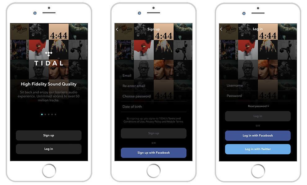
Tidal Signup Screen App Design
Tidal's User-Friendly App Highlights The Brand's Dedication To High-Quality Music

The History Of Tidal And Jay-Z's Influence
Tidal is a subscription-based music-streaming service like Apple Music and Spotify that allows users to listen to all their favorite artists from their mobile phones, tablets and desktop computers. The service was founded in 2014, and today it boasts more than 50 million titles. It's also the leader in high-quality music, offering the best sounds quality of its competitors.
And it pays its artists accordingly, paying the highest percentage of royalties to its artists and songwriters.
According to the brand, this is what makes Tidal unique:
TIDAL brings music fans closer to their favorite artists and gives on-demand access to discover new music from our massive music and video catalog. TIDAL's extensive catalog is supplemented by exclusive content, including exclusive videos and songs featuring the world's top musicians, athletes and entertainers and up-and-coming independent artists. We offer not only access to exclusive digital content, but also the ability to participate in unique real life experiences such as concerts with established or emerging artists and other direct interactions between fans and their favorite artists. Human curation is an important part of what we do at TIDAL, and we have an expert group of tastemakers to help select and promote emerging artists to a broader audience via our TIDAL Rising program. We also provide a choice of both premium and HiFi music quality that enables fans to experience music as the artists intended it to be heard. TIDAL now offers Master Quality Authenticated technology, which is a way of compressing digital music without limitations to deliver guaranteed master-quality sound. This allows subscribers to hear music just as it was recorded in the studio; an audio experience as the artist intended.
Tidal was founded by Aspiro in 2014, but in 2015, it was acquired by none other than the infamous Jay Z. And after the purchase, the brand quickly rolled out a rebranding campaign that got a large portion of the music community involved to promote it. As a result, more celebrities jumped on board making Tidal the first artist-owned music streaming service in the world.
Tidal has made its mark due to its high royalties, high fidelity, lossless audio quality and exclusive, first-access rights to songs, music videos and albums.
Today, Tidal operates in 52 countries making it a worldwide phenomenon.
Thanks to Jay Z, the brand was able to get back on its feet and relaunch itself as a fresh, modern and exciting music streaming service that put artists first. It puts an emphasis on the auditory experience and musical artistry, offering its subscribers access to music before anyone else, solidifying its place as a leader in quality music streaming. And its app helps promote this tenfold.
Tidal's Moody Interface Uses Color To Emphasize Powerful Music Listening
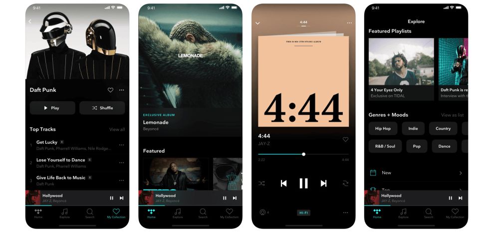
Tidal is an exciting and moody mobile platform that incorporates many seductive and mysterious design elements to promote music listening and enjoyment. From the second you download the app to the 500th time you've searched through it, this dark and luxurious interface pulls you in.
The black background is rich and superior, sitting as the perfect, clean backdrop to the song titles, clever icons and music videos that line each landing page.
According to color psychology, black means luxury, mystery, darkness and danger. It's tantalizing and tempting. It's almost seen as taboo — but it's also seen as something that's in high demand and is wanted.
And this app makes use of this color in a spectacular way. The subtleness of the black lulls you through the app and puts you in the perfect mindset to stream music, watch videos and connect with the musical artistry that the app has to offer.
The black background also makes the images on this interface pop — they are vivid on their own, but when paired against the blackness, the contrast truly shines. This app is iconic and elusive. It's enigmatic and majestic. And it puts the music front and center, with the titles and colors flowing fluidly along the screen and fading excellently into the serene black background.
The Tidal App Focuses Heavily On Images To Show Off Musical Talent
Tidal is an app dedicated to music, but that doesn't mean it's going to let its visual design slack.
The clean, simple and black interface is the perfect backdrop to the titles that stand prominently in the foreground. Music videos play seamlessly, fading slightly around the edges and adding a gradient-like element that is modern, fresh and exciting. Similarly, each title and album is represented by an eye-catching and bold image, and these images line the interface in clean and captivating ways.
Going with an image-heavy interface is a common theme in streaming app design — both in music streaming and video streaming. It gives users something more tangible to interact with, easing navigation and creating a more user-friendly interface that leads users from page to page with ease.
Whether users are looking to discover new music, search for their favorite titles or scour their customized offering, these images make it clear where they can look and how they can get the most out of the app.
Images have been proven to have a greater impact on consumers than text alone. They are remembered better, noticed more immediately and lend themselves to a more positive way of thinking about the brand and the platform. The use of imagery here lightens the mood and fosters a friendly and approachable atmosphere that users are happy to interact with.
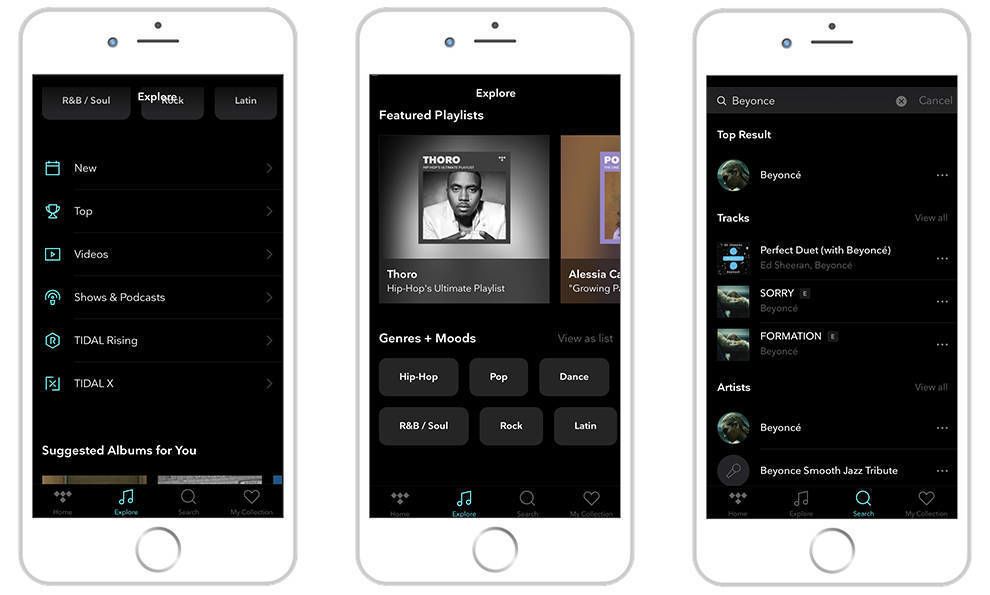
Navigation Is Further Simplified By Simple Iconography And Clear Search Functionalities
Navigating from landing page to landing page is easy thanks to the simple menu bar that lines the bottom of the screen, the bold and clean images that encompass the song titles and albums as well as the simple iconography that simplifies the search process and makes finding new categories a breeze.
The menu bar at the bottom of the page is outlined with clear icons that lead users from the homepage, to the Explore page, Search page and My Collection page. These sections are also clearly organized in rows and columns using bold white typography, bright images and clean icons that take the guesswork out of navigating the app.
A seamless user journey is vital for a successful app — especially one that deals with streaming services. There are millions of titles to sift through, and users don't want to feel stressed or anxious thanks to all the choices. And the Tidal app simplifies the entire journey with a clear organizational layout, smooth background, bold imagery and a tantalizing atmosphere.
But best of all, this app and brand as a whole puts the music first. It emphasizes new titles, rising artists and socially-relevant content. It's an intuitive app that connects music listeners with the tunes that will affect them the most.
Need more insights and inspiration? Sign up for the DesignRush Daily Dose!

The Key Elements Of Effective Music Streaming Mobile App Design
Music streaming apps are on the rise, and with them come some impactful design elements that make them shine.
Cleanliness, clear organization and a minimal design are all necessary requirements for streaming apps — from music to video and beyond. With the long lost of title offerings, brands have to come up with a way to connect users to these options with ease and satisfaction. If your app is confusing or unclear, users will turn to another subscription service.
Similarly, your brand needs to make sure you're connecting people with the content they actually want. You have to have the best contracts and license agreements with artists and distributors. People want to listen to new songs as soon as they come out — and the same goes with video. The competition is constantly expanding, and you need to as well.
It's also important to understand the impact of imagery. In some industries, too much photography or iconography can be distracting and unprofessional, but when it comes to streaming apps its essential. These help to immerse users into the overall experience of the app and foster a sense of excitement and anticipation.
Brands need to create an experience in their app. And it needs to be an experience that is consistent with the brand wherever they go. Recently, streaming apps like Spotify have been working on their desktop interfaces to promote listening everywhere and everywhere. Other brands can take note of this, creating a comprehensive brand identity and experience across platforms and mediums to establish trust and authority in their niche.
![]()
The Tidal App's Dark & User-Friendly Interface Places Focus On Artistry And High-Quality Music
Tidal is an app that's known for its notable artists and dedication to music artistry. It's a brand that cares about the music, and cares about its creators, awarding them with compensation that is actually sustainable and livable.
It's also known for its owner — Jay Z — and his creative and successful rebranding and relaunch of the service.
But when you dive into the app, you see the masterpiece that went into its creation. There's a focus on the music, of course. And this can be seen in its bold imagery, dark background and exciting new content.
But it's also user-friendly, with seamless navigation, clean menu bars and clever iconography.
This is an app that was created for users. And it was created to highlight the exciting, can't-get-it-anywhere-else content that the brand is constantly working to provide.
The Tidal app is a mysterious, modern and edgy interface that makes music-streaming seductive and fun.
Do you have an app idea in mind? These app design and development companies can help you bring your idea to life!
If you need more app design inspiration, check out our Best App Design section!
- 4,546
- Industries: Arts & Recreation Entertainment Technology
Tidal Signup Screen App Design
Source: https://www.designrush.com/best-designs/apps/tidal-user-friendly-app
Posted by: hallwhats1993.blogspot.com
0 Response to "Tidal Signup Screen App Design"
Post a Comment